The BOM have updated some of their climate datasets, rainfall for Sydney now goes to December 2013, temperature to May 2013.
I’ll keep updating as the graphs as the BOM releases more data!
The BOM have updated some of their climate datasets, rainfall for Sydney now goes to December 2013, temperature to May 2013.
I’ll keep updating as the graphs as the BOM releases more data!
This is a collection of unusual structures on the underside of a small sandstone overhang. It’s made of different material than the surrounding sandstone, it’s a hard to the touch with no visible sand grains. Most of the surface is made of tiny nodules that almost look like condensation on a cold surface. In the center is a more prominent raised area that looks like a cast of an animal burrow.

It’s located at the base of a gully near a creek, it looks like it goes through wetting and drying cycles as rain runoff flows and drys. I wonder if it could be the slow build up of minerals that are carried in the water then are deposited as it drys out.

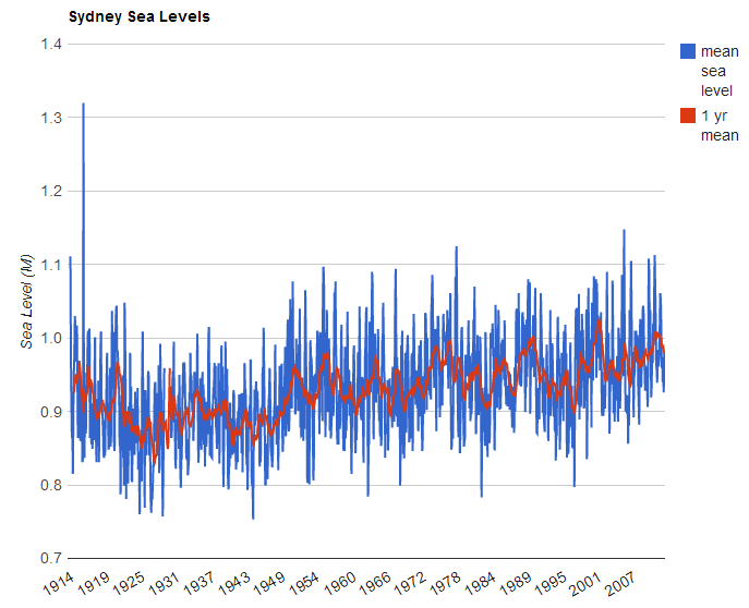
More data from the BOM, this time I’m plotting their historical tidal measurements along with moving averages over 6 months, 1 year, 5 years, 10 years and 30 years.
Tidal measurements are for Sydney taken from the Fort Denison gauge, the data includes monthly averages for low and high tides and the mean, going back to 1914.
Like the temperature data there are local rises and falls that last 10 years or more, but the consistent long term trend is up.
Click through to have a play with the chart, select the data sets you want and they will be displayed.

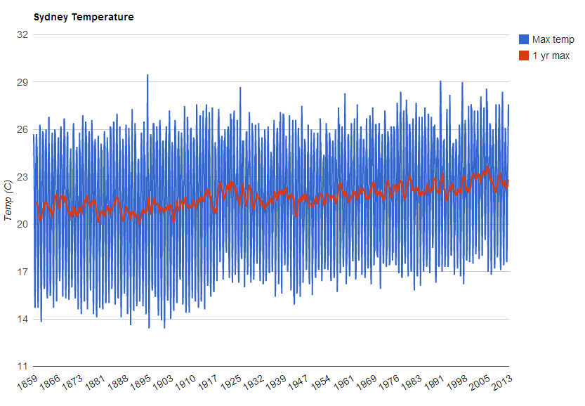
Besides the boring old weather the Bureau of Meteorology website has a lot of pretty cool stuff. Something I’ve been digging into lately is their climate data. Depending on the weather station you can find rainfall, maximum and minimum temperatures going back over 150 years.
I’ve used their temperature data for the Observatory Hill station in Sydney to make a graph over time, I’ve also calculated moving averages over various time periods. It’s turned out some pretty interesting results. There’s a clear warming trend since the early 1900’s for maximum temps and around the mid 1940’s for minimums, but it’s not all smooth, there have been some ups and downs that have lasted over 10 years.
Click through to the interactive graph and have a play, you can turn the various data series on and off to compare. You have to be a bit patient, it can take a few seconds after you click to send through the new data points and graph them.
